How Many Fonts Should a Brand Have? A Casual Dive
Table of Contents
- Why Font Choices Matter
- Choosing Fonts That Fit Your Brand
- Common Pitfalls
- Tips for Font Pairing and Usage
- FAQs
- Conclusion
You know, I was sipping my morning coffee — the one that always leaves little brown rings on my desk (don’t ask, I swear it’s artistic) — and I started thinking about fonts. Fonts! Of all things. Funny, right? But seriously… for anyone trying to build a brand, fonts are like the invisible outfit your brand wears every day. And then I thought, “Wait, how many fonts should a brand have?” Honestly, it feels like one of those deceptively simple questions that spiral into a rabbit hole.
I mean, you look at some big brands — Apple, Coca-Cola, Netflix — and their fonts just feel effortless. Clean. Recognizable. But how did they land on those choices? Did someone just pick one, or did they test a thousand? I remember the time I tried to design a tiny blog logo using three fonts — total chaos. Seriously, I think my brain short-circuited halfway through. And then there’s the temptation to try fancy medieval stuff (check this out) or even a Western-style vibe (here’s one) — fun, but can your brand really wear cowboy boots and a velvet cloak at the same time?
So, let’s just talk this through. Slowly. Messily. Because honestly, figuring out your brand’s font strategy is part science, part gut feeling, and mostly trial-and-error (like most things in life, right?).
Why Font Choices Matter
Alright, let’s get one thing straight: fonts are powerful. They carry personality. They whisper or shout your brand’s voice without a single word. A serif font? Might feel classy, trustworthy, traditional. A sans-serif font? Modern, clean, minimal. Throw in a handwritten script, and suddenly your brand feels approachable, quirky, maybe a bit messy (like me on Mondays).
I remember designing a poster once for a friend’s small shop — tried three fonts, not coordinating at all. Looked like a ransom note, honestly. People laughed. I cried internally. Lesson learned: fonts convey emotion instantly. You don’t need to explain your vibe if the letters do it for you.
So when we ask how many fonts should a brand have, the deeper answer is: as few as possible. Keep it simple. Most pros recommend:
- Primary Font: The main workhorse. Headlines, logos, major text.
- Secondary Font: Supporting font. Body text, smaller captions.
- Optional Accent Font: Only if your brand needs personality in small doses.
And that’s it. Three max. Honestly, anything more is flirting with chaos. Also, a something I learned late in life: spacing matters as much as the font itself. Kerning, line height, letter spacing… all these tiny details create the difference between “this looks legit” and “why does this feel like a ransom note?”
.png)
Choosing Fonts That Fit Your Brand
Okay, let’s be real. Choosing a font isn’t just about picking something pretty. You could spend hours scrolling Google Fonts, Adobe Fonts, or weird generators (medieval style or Western style), and honestly, it gets addictive.
Step 1: Identify Your Brand Personality
Ask yourself: is my brand playful, serious, traditional, modern, edgy? Fonts speak louder than slogans sometimes. For example, a Gothic style font might be perfect for a fantasy shop but terrible for a financial consulting firm. And yes, I once tried the Gothic vibe for my finance mock-up… never again. My accountant friend laughed.
Step 2: Pair Wisely
If you have a serif headline font, try a sans-serif body font. If your primary font is fancy and decorative, keep the secondary simple. The trick? Contrast without conflict.
Step 3: Test in Real Life
Print it. Post it online. Show friends. My cat once “approved” a font by walking across my keyboard, which I took as a sign (not kidding). Seriously though, test your font in real contexts — websites, banners, ads — before committing.
Step 4: Limit Accent Fonts
Optional accent fonts should be rare. Like sprinkles on a cupcake, not the whole dessert. Maybe for seasonal campaigns or special promotions. Anything more, and your brand looks like it’s trying too hard.
Common Pitfalls
- Too Many Fonts: Your brand becomes a circus. I once counted five fonts on a tiny flyer… it gave me anxiety.
- Ignoring Readability: Fancy fonts might look cool, but if people squint to read your headline, it fails.
- Over-using Accent Fonts: Sprinkle, don’t dump the whole bag. Otherwise, even if it’s “cool” today, tomorrow it will feel dated.
Funny enough, one time I used a Western font for a Halloween party invite. People loved it. The next year, I tried Gothic, and it felt dramatic but… confusing. Moral: context matters as much as the font itself.
Tips for Font Pairing and Usage
- Stick to Two Fonts (Usually): One primary, one secondary. Optional third if needed. Keep everything else consistent.
- Hierarchy Is Key: Bigger fonts for headlines, smaller for body, medium for subheadings. Makes reading intuitive.
- Combine Styles Sparingly: Mix a serif with a sans-serif or a modern font with something classic. Look at big brands for inspiration — Apple, Nike, Spotify — minimal but memorable.
- Use Font Generators for Inspiration: Online tools can give you weird, fun ideas. For example, medieval generators (here) or Western-style (here) might spark creative campaigns. Just don’t copy blindly.
Side note: fonts are like fashion trends. What’s “in” today might feel outdated in a year. Keep your core fonts consistent but allow subtle updates occasionally. Think seasonal color palettes but for typography.
FAQs
Q1: How many fonts should a brand really have?
Two main fonts are ideal — primary and secondary. Optional accent fonts are okay for special cases, but three fonts max. Keep it simple.
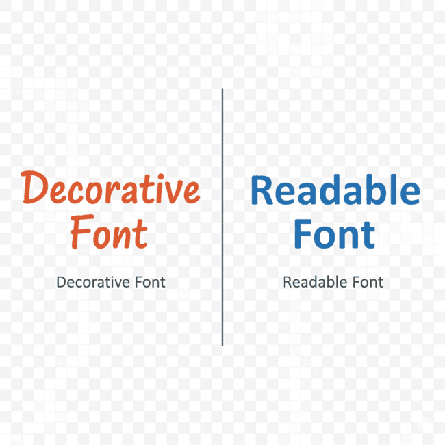
Q2: Can I use decorative fonts for body text?
Usually, no. Decorative or script fonts are harder to read in paragraphs. Stick to simpler fonts for large text blocks.
Q3: How can I test font combinations?
Print, digital previews, or even ask friends. Small experiments prevent big mistakes. Also, check generators like medieval or Western for inspiration.
Q4: Are free fonts reliable for branding?
Many are fine, but check licenses. Commercial projects might need paid versions. Always read terms.
Q5: Can fonts change a brand’s perception?
Absolutely. Fonts communicate tone and personality instantly. Choose wisely.
Conclusion
So, what’s the takeaway here? Fonts aren’t just decoration. They’re the voice of your brand in silent form. When I think about how many fonts should a brand have, I honestly believe: less is more. Primary, secondary, optional accent — keep it simple, clear, readable, and aligned with your vibe.
Experiment with online tools, try different styles (medieval, Western), and don’t be afraid to test. Fonts can feel like a tiny detail, but they shape perception, evoke emotion, and — weirdly enough — make or break your design credibility.
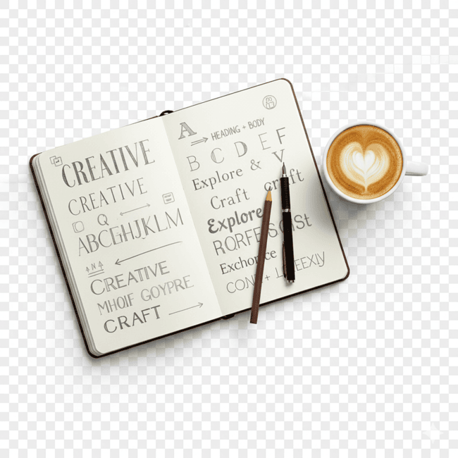
So next time you pick fonts, sip your coffee, doodle a little in your notebook, and remember: your font choices are like the outfit your brand wears. Make it count. And maybe… just maybe, have fun with it.