What Font Does ChatGPT Use (and why It Feels So Familiar)
Table of Contents
You ever notice how you can stare at ChatGPT for hours — typing, waiting, thinking — and never once stop to wonder what font it’s using? I mean, we spend so much time here, and yet it’s like not realizing the color of your own bedroom walls until you move out. Funny how the brain just accepts things that feel… right. But now that you’ve asked — what font does ChatGPT use? It’s one of those small curiosities that once it pops into your mind, you can’t let it go. And yeah, the answer seems simple at first (just check, right?), but it’s actually kind of a rabbit hole. Fonts carry moods. They have personalities. They whisper “I’m professional” or “I’m fun” or “I’m a robot pretending to be human.” And ChatGPT? Well, it sits somewhere in between all that — quietly neutral yet strangely comforting.
When Fonts Become Invisible (But Not Forgettable)
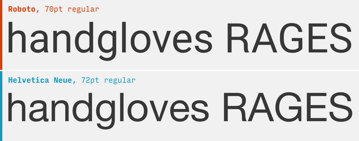
So here’s the thing: the font that ChatGPT uses depends on where you’re seeing it. On the web version, it’s typically “Inter” — a clean, modern, sans-serif font designed specifically for digital readability. I didn’t even notice that until someone mentioned it on Reddit, and I was like… huh. Of course. It’s one of those fonts that doesn’t demand attention. It’s the background character in a movie — the one holding everything together but never stealing the scene. And honestly, that makes sense. You don’t want a fancy cursive font when you’re reading long replies about AI ethics or debugging Python code.
But here’s the part that gets me: “Inter” wasn’t always everywhere. A few years ago, designers obsessed over Helvetica or Roboto (you know, those fonts that seem to pop up on every tech product). Inter came later — built with this kind of human-meets-UI energy. It has just enough warmth to feel approachable but still crisp enough to look like it belongs in a digital world. It’s basically the “friendly-but-efficient coworker” of fonts.
Sometimes I imagine fonts as people in an office. Helvetica’s the boss — clean suit, organized desk, slightly intimidating. Comic Sans is that one intern everyone teases but secretly loves. Inter? Inter’s the quiet designer who fixes everyone’s presentations at 2 a.m. and never complains. That’s probably why OpenAI picked it — or at least, it fits the vibe perfectly.
And, you know, fonts have this power to shape tone even before you read the first word. Think about it — if ChatGPT’s interface used something like a medieval-style font, we’d feel like we’re chatting with a wizard from the 1400s. Or if it used a wild western-style font, maybe it’d feel like some dusty outlaw AI ready to duel with words at high noon. The font choice quietly says, “Relax, this is modern. Trustworthy. Neutral.” That matters more than we realize.
The Psychology of Fonts (and Why Inter Works So Well)
Ever heard of “typographic voice”? It’s this idea that every font speaks — not with words, but with personality. Serif fonts tend to sound traditional or academic (like something from an old book). Sans-serifs like Inter sound more clean and accessible, like an app you already know how to use. That’s exactly what you want in an AI chat. Something that doesn’t distract, doesn’t posture. Just listens, replies, stays out of the way.
Honestly, sometimes I wish life worked like that. Like, imagine if our thoughts came in readable fonts. When you’re stressed, your brain starts typing in bold, jagged letters — all caps. When you’re calm, it’s just Inter. Simple. Steady. Evenly spaced. You can almost breathe between the lines.
Funny enough, I once changed the default font in my notes app just to see how it’d feel. I tried a script font — beautiful, elegant — and couldn’t read my own grocery list. Then I went back to Inter (or maybe it was Roboto) and everything looked… reasonable again. Fonts shape how we think, even when we’re not paying attention. Maybe that’s why ChatGPT feels calm to use — because it’s designed to be invisible in all the right ways.
Fonts, Feelings, and That Subtle OpenAI Aesthetic
If you’ve noticed, OpenAI’s entire branding leans into this minimalist calm — almost Apple-like but less shiny. There’s this quiet confidence about it. The font is never the star, but it’s always doing heavy lifting behind the scenes. When you read a ChatGPT answer, it’s not supposed to feel like reading a corporate report. It’s supposed to feel conversational. Human. A little imperfect. And that’s hard to achieve with typefaces that are too mechanical.
You know what’s funny? The more I look at the ChatGPT interface, the more I realize how much restraint went into it. Designers could’ve chosen something trendier — maybe a geometric sans or something with quirky ligatures — but no. They went for readability. Neutrality. It’s the typographic version of a good friend listening — not talking over you.
Sometimes I open an old Microsoft Word doc just to compare. There’s Calibri staring back at me, polite but stiff. It’s not bad — just… office-y. Then I switch back to ChatGPT, and everything feels lighter. Maybe that’s what Inter does: it carries this invisible friendliness. Like a chat bubble that says, “Hey, don’t overthink this. Just type.”
There’s also something about spacing — the line height, the rhythm of it all. It’s weirdly musical. If you look closely (I know, who does that?), you’ll see how the letters breathe. Enough room to rest your eyes between words. That’s what makes it feel natural — almost conversational, which suits an AI that’s supposed to mimic conversation. Honestly, it’s all kind of genius.
FAQs: Tiny Curiosities About ChatGPT’s Font
Q: Is it always Inter?
Mostly yes, but technically it can look different depending on your device or browser. If your system doesn’t have Inter, it’ll swap with a fallback like Arial or Helvetica. Still, the goal is the same — clarity over flair.
Q: Can I change ChatGPT’s font?
Not directly on the site. But browser extensions or custom CSS tools can tweak it if you’re into experimenting. Just be careful — readability can vanish faster than you’d think when you mess with type.
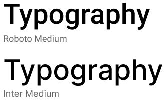
Q: Why does Inter feel so familiar?
Because it’s used in a ton of modern products — Figma, GitHub, Linear, even Notion at one point. It’s become this quiet standard of the modern internet, like a visual handshake between design and functionality.
Q: What makes it better for long reads?
Well, Inter was literally designed for that. The guy who made it (Rasmus Andersson, by the way) built it for screen legibility. It scales beautifully on high-resolution displays, which makes it perfect for apps like ChatGPT that live in your browser for hours.
Check out our font generator for more examples and tools.
Why We Care (Even If We Pretend We Don’t)
So maybe the question isn’t just “what font does ChatGPT use” — it’s “why do we care?” And I think it’s because fonts are emotional architecture. They quietly frame how we experience words. You could read the exact same sentence in two different fonts and feel totally different about it. Try typing your favorite quote in a gothic typeface — it suddenly sounds dramatic. Type it in Inter — it sounds wise but chill.
I guess that’s why we build font generators in the first place. They let us play. They remind us that style is part of the story. If ChatGPT had a font switcher, I bet half of us would spend hours making it look like old newspapers or space-age neon signs — and then quietly switch back to default because, let’s be honest, reading long text in novelty fonts is exhausting.
There’s a beauty in simplicity. And maybe that’s the lesson here. Fonts like Inter don’t need to be loud because the words — your words — are already doing the talking. The font just… listens.
Conclusion
So yeah — ChatGPT mostly uses Inter. But maybe that’s not really the point. The point is how something so simple can make technology feel more human. We don’t think about fonts until one feels wrong — and that’s how you know a good one’s working. It stays invisible. Effortless. Like breathing or background music in your favorite café.
Next time you’re typing away, maybe pause and notice it — that quiet rhythm, those balanced letters, that calm voice on the screen. It’s just a font, sure. But it’s also the design equivalent of trust. And honestly? That’s pretty cool.